Create the perfect toggle switch with pure HTML / CSS, no JavaScript necessary
Based on input element type checkbox, styled with CSS pseudo-elements ::before and ::after and pseudo-class :checked
Goal
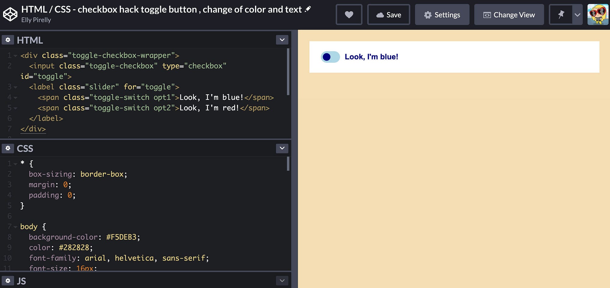
This is the toggle switch that will be created:

- an elliptical toggle switch in pure HTML and CSS (no JavaScript necessary)
- when toggled (click): change of color and text content
- based on/use of the HTML element
<input type="checkbox">, here, modification through CSS styling, also known as “checkbox hack” - a bigger hit area through the use of the associated HTML element
<label>which enables toggling the switch while clicking the text next to it— not only the tiny little toggle switch itself— this makes it easier to toggle between options
Precondition
The HTML element <input type="checkbox"> brings the desired behavior out of the box — it is rendered by default as a box that is checked or unchecked when clicked/ticked. The default appearance of the HTML element <input type="checkbox"> depends on the browser, see the default appearance for a checkbox in Chrome below. While styling our toggle switch, these default stylings will be overwritten.
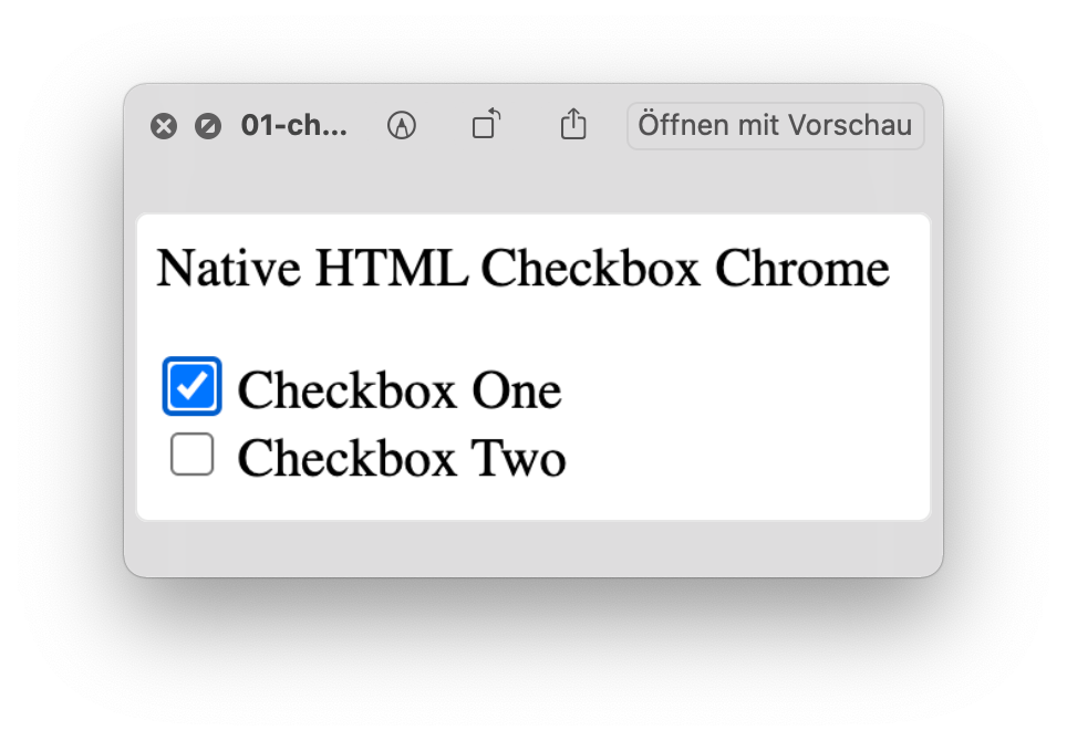
<input type="checkbox"> with :focus and :active state and :checked attribute for the first checkboxThe pseudo-class :checked allows to turn a single value on and off. Present as an attribute within HTML element <input type="checkbox" checked> the checkbox is toggled on by default. For our toggle switch, the :checked won’t be present within the HTML but will be used as pseudo-class within the CSS.
Read more about the HTML element input type checkbox on MDN Web Docs
Not into reading further?
See final CodePen here:
The HTML
<div class="toggle-checkbox-wrapper">
  <input class="toggle-checkbox" type="checkbox" id="toggle">
  <label class="slider" for="toggle">
    <span class="toggle-switch opt1">Look, I'm blue!</span>
    <span class="toggle-switch opt2">Look, I'm brown!</span>
  </label>
</div>- the outer
<div>element is used to wrap the<input>element and<label>element — it’s nicer to have all of the toggle switch in a dedicated container - the
<input>element needs to have theidattribute to make the toggle switch work - the
<label>element needs to have theforattribute to make the toggle switch work - the
idattribute and theforattribute both need to have the same value, this “connects” the<input>element to the<label>element - the
<label>element must appear after the<input>element - two
<span>elements are needed, as there will be two texts to toggle between - clicking on the
<label>element generally enables a bigger hit area, in our case the size of this hit area depends on the length of the text within the<span>(s)
The CSS
* {
  box-sizing: border-box;
  margin: 0;
  padding: 0;
}body {
  background-color: #F5DEB3;
  color: #282828;
  font-family: arial, helvetica, sans-serif;
  font-size: 16px;
  font-weight: 700;
  padding: 24px;
}.toggle-checkbox-wrapper {
  background-color: #fff;
  padding: 24px;
}
- reset
*is set to get the usual box-sizing, margin and padding issues out of the way bodysets very general stylings and the font.toggle-checkbox-wrapperis the outer<div>element styling, just minimal styling not necessary for the toggle switch itself
Styling on the <input> element:
.toggle-checkbox {
  display: none;
}
.toggle-checkbox { display: none; }on the<input>element hides the default checkbox appearance, see Chrome example above
Styling on the <label> element:
slider {
  position: relative;
}/* ellipsis */
.slider::before {
  background: lightblue;
  border-radius: 34px;
  bottom: 0;
  content: '';
  height: 24px;
  margin: auto;
  position: absolute;
  top: 0;
  width: 40px;
}/* circle */
.slider::after {
  background: navy;
  border-radius: 50%;
  bottom: 0;
  content: '';
  height: 16px;
  left: 4px;
  margin: auto;
  position: absolute;
  top: 0;
  transition: 0.4s;
  width: 16px;
}
.slideron the<label>element in a broader sense is the ellipsis but — important! — doesn’t get a lot of styling in our case- instead, the ellipsis and the circle will be created and styled via pseudo-element
.slider::beforefor the ellipsis and pseudo-element.slider::afterfor the circle - the default for both, ellipsis and circle, is the blue version
- in these pseudo-classes shared stylings that both the brown and the blue version use are put
Styling on the <span> elements:
.toggle-switch {
  margin-left: 50px;
}.toggle-switch.opt1 {
  color: navy;
}.toggle-switch.opt2 {
  color: brown;
  display: none;
}
.toggle-switchon both<span>shas.margin-left: 50px;to distance the text from the ellipsis.toggle-switch.opt1on first<span>gets blue text color.color: navy;.toggle-switch.opt2on second<span>gets brown text color.color: brown;anddisplay: none;to hide this<span>otherwise you would see both texts
Back to the <input> element:
.toggle-checkbox:checked + .slider::before {
  background-color: lightsalmon;
}.toggle-checkbox:checked + .slider::after {
  background-color: maroon;
  transform: translateX(16px);
}
.toggle-checkbox:checked + .slider::beforewill toggle the lightblue background-color of the ellipsis.toggle-checkbox:checked + .slider::afterwill toggle the lightbrown background-color of the circletransform: translateX(16px);will push the brown circle 16px to the right on the x axis
.toggle-checkbox:checked ~ .slider > .toggle-switch.opt1 {
  display: none;
}.toggle-checkbox:checked ~ .slider > .toggle-switch.opt2 {
  display: inline-block;
}
display: none;will — on click — hide the blue versiondisplay: inline-block;will — on click — display the brown version- and vice versa
Conclusion
After wrapping my head around this and taking the time to dig into it I was honestly surprised how easy this is and how little code is needed to create a perfect toggle switch.
Actually, I’ve coded this in SCSS which in my opinion makes it even easier to understand what’s happening.
Only need a very basic toggle switch? I got you covered, see here:
